Have an account?
Log in to check out faster.
Spend £50 more for free delivery
Loading...
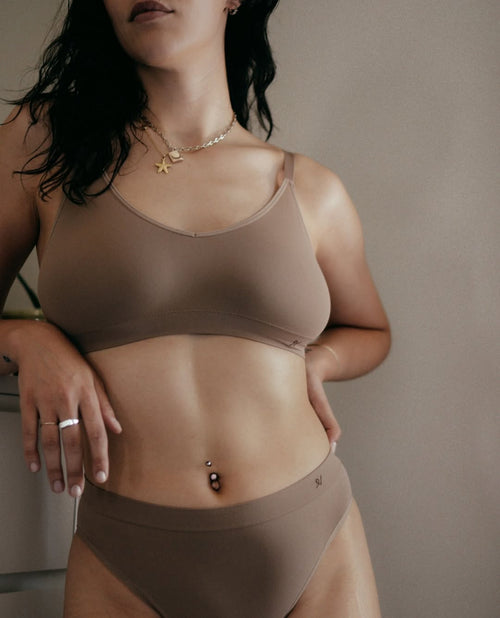
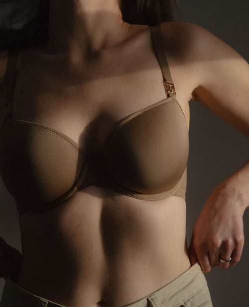
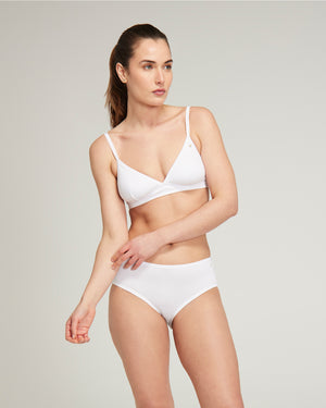
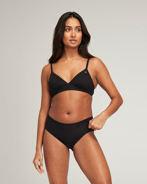
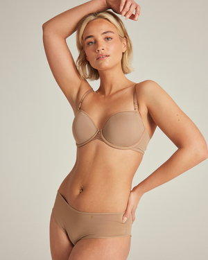
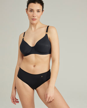
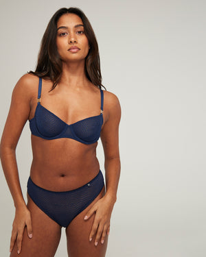
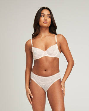
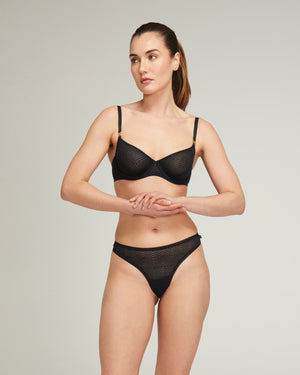
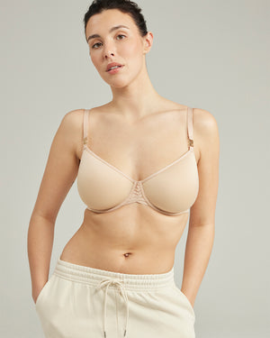
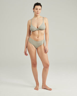
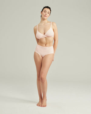
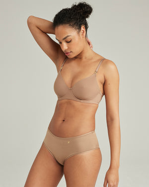
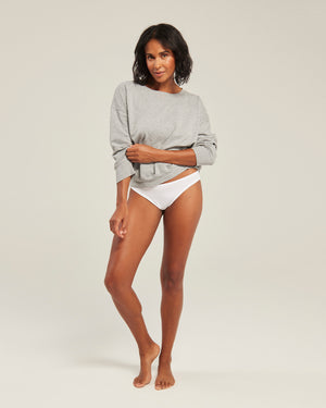
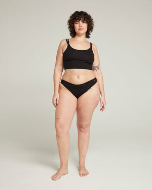
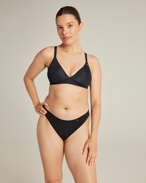
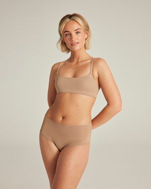
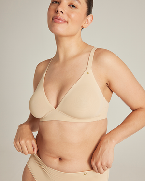
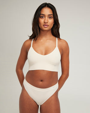
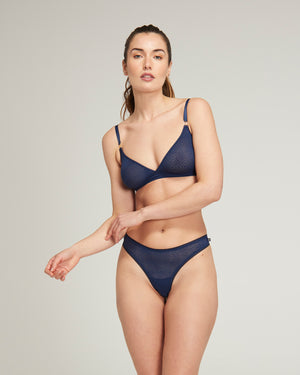
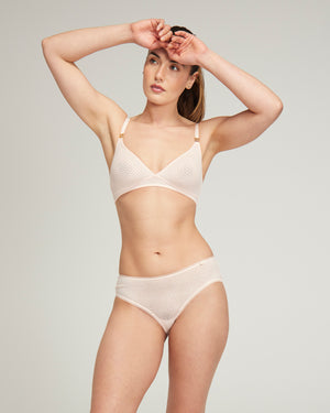
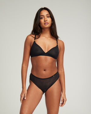
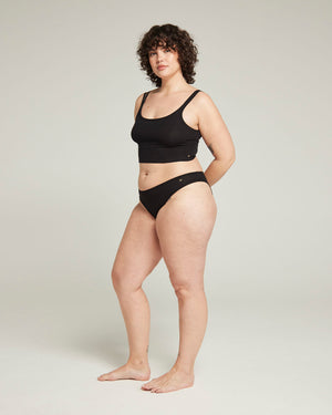
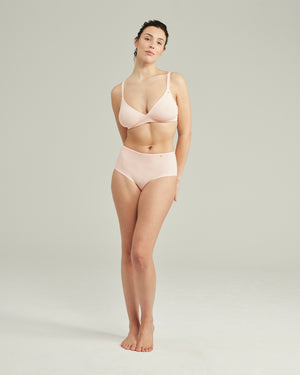
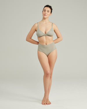
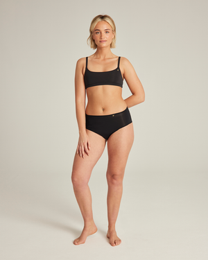
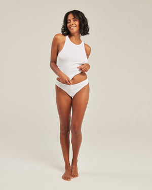
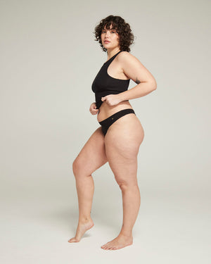
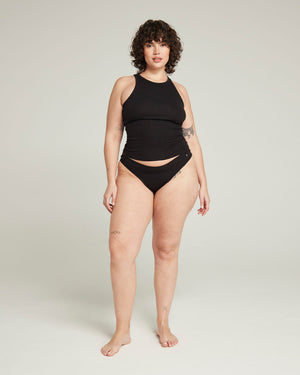
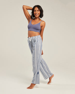
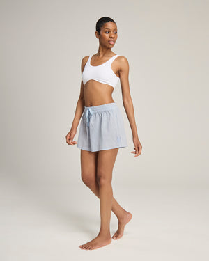
Invisible Underwear
Each purchase will provide a donation to Smalls for All®. Learn More
We will send you an email to reset your password
Free Delivery on all orders over £70
Welcome to our store
Mystery Month: Random Refunds on select orders
Currency


