Color brings a design to life. Color is versatile; it's used to express emotion and tone, as well as place emphasis and create associations.
$COLOR_PRIMARY
$COLOR_SECONDARY
$COLOR_TEXT_PRIMARY
$COLOR_TEXT_SECONDARY
$COLOR_TEXT_LIGHT
$COLOR_TEXT_INVERSE
$COLOR_BACKGROUND_DARK
$COLOR_BACKGROUND_LIGHT
$COLOR_BACKGROUND_WHITE
$COLOR_BORDER_LIGHT
$COLOR_LINK_HOVER
$COLOR_LINK
$COLOR_LINK_HOVER
$COLOR_BUTTON
$COLOR_BUTTON_HOVER
$COLOR_SUPPORT_INFO
$COLOR_SUPPORT_SUCCESS
$COLOR_SUPPORT_WARNING
$COLOR_SUPPORT_ERROR
$COLOR_SUPPORT_FOCUS
Icons are designed to be simple, modern, friendly, and sometimes quirky. Each icon is reduced to its minimal form, expressing essential characteristics to either replace or accompany labels.
Spacing variables are used to consistently apply margin and padding across components and UIs. Having a set spacing scale brings a rhythm to the product and creates a natural and familiar flow from page to page.
$SPACING_3XS
$SPACING_2XS
$SPACING_XS
$SPACING_S
$SPACING_M
$SPACING_L
$SPACING_XL
$SPACING_2XL
$SPACING_3XL
$LAYOUT_2XS
$LAYOUT_XS
$LAYOUT_S
$LAYOUT_M
$LAYOUT_L
$LAYOUT_XL
$LAYOUT_2XL
Typography is used to create clear hierarchies, useful organizations, and purposeful alignments that guide users through the product and experience. It is the core structure of any well designed interface.
Display 1
Display 2
Display 3
Heading 1
Heading 2
Heading 3
Heading 4
Heading 5
Heading 6
Subtitle 1
Subtitle 2
Lead
Paragraph
Body 1
Body 2
Lorem ipsum dolor sit amet, consectetur adipiscing elit. Integer posuere erat a ante.
- Ordered List level 1
- Ordered List level 2
- Ordered List level 2
- Ordered List level 1
- Ordered List level 1
.list, .list--ordered,
.list--nested, .list__item
- Unordered List level 1
- Unordered List level 2
- Unordered List level 2
- Unordered List level 1
- Unordered List level 1
.list, .list--unordered,
.list--nested, .list__item
You can use the mark tag to highlight text.
This line of text is meant to be treated as deleted text.
This line of text is meant to be treated as no longer accurate.
This line of text is meant to be treated as an addition to the document.
This line of text will render as underlined
This line of text is meant to be treated as fine print.
This line rendered as bold text.
This line rendered as italicized text.
Accordion enables users to expand and collapse sections of content.
-
Apples are a fine fruit often associated with good health, and fewer doctor's appointments.
Example. An apple a day keeps the doctor away.
-
Apples are a fine fruit often associated with good health, and fewer doctor's appointments.
Example. An apple a day keeps the doctor away.
-
Kiwis are a fun, under-appreciated fruit.
A component that can wrap any type of content to highlight information for a user or to just draw attention to a specific element.
Indicate the current page’s location within a navigational hierarchy that automatically adds separators via CSS.
Custom button styles for actions in forms, dialogs, and more with support for multiple sizes, states, and more.
.button--outlined
.button--outlined
.button--outlined
Checkboxes are used when there is a list of options and the user may select multiple options, including all or none.
A utility selector that allows the user to update all prices on the store to the selected currency.
Examples and usage guidelines for form control styles, layout options, and custom components for creating a wide variety of forms.
A re-usable notification which dynamically updates based on items in the cart.
Spend $50.00 for free delivery.
Lists consist of related content grouped together and organized vertically.
- Ordered List level 1
- Ordered List level 2
- Ordered List level 2
- Ordered List level 1
- Ordered List level 1
- Unordered List level 1
- Unordered List level 2
- Unordered List level 2
- Unordered List level 1
- Unordered List level 1
Loading spinners are used when retrieving data or performing slow computations, and help to notify users that loading is underway.
Add dialogs to your site for lightboxes, user notifications, or completely custom content.
Modal title
Hello World
Lorem ipsum dolor sit amet, consectetur adipiscing elit. Nulla accumsan, metus ultrices eleifend gravida, nulla nunc varius lectus, nec rutrum justo nibh eu lectus. Ut vulputate semper dui. Fusce erat odio, sollicitudin vel erat vel, interdum mattis neque.
- In fermentum leo eu lectus mollis, quis dictum mi aliquet.
- Morbi eu nulla lobortis, lobortis est in, fringilla felis.
- Aliquam nec felis in sapien venenatis viverra fermentum nec lectus.
- Ut non enim metus.
Redirect modal is used to warn and direct incoming traffic to the correct store.
Notifications are messages that communicate information to the user.
Notification title
Notification text goes here.
Notification title
Notification text goes here.
A component that is used to concatenate long sets of data for a user to consume information easier.
The appearance of payment icons help reinforce the feeling of security on the website. These are the currently enabled payment options defined in the store settings.
Form field to decrement or increment a number input using attached buttons. Each quantity selector has a unique identifier to avoid conflicts.
Radio buttons are used when a list of two or more options are mutually exclusive, meaning the user must select only one option.
A special input field used as the primary means of discovering content, or as a filter to aid the user in finding content.
Select is a type of input that is used in forms, where a user is submitting data and chooses one option from a list.
A highly stylised radio input with the appearance of a selected choice card. There are active, inactive, disabled and empty states for each swatch. Can be used as labels or with filled backgrounds.
Text inputs enable the user to interact with and input data. Use when the application requires long-form content from the user.
Validation error message here.
Optional helper text here; if message is more than one line text should wrap (~100 character count maximum)
Validation error message here.
Optional helper text here; if message is more than one line text should wrap (~100 character count maximum)
Links are used primarily as a navigational element. Links may also change what or how data is displayed (view more, show all). If the action taken by the user will change or manipulate data, use a button.
Cover listing
Featured blog
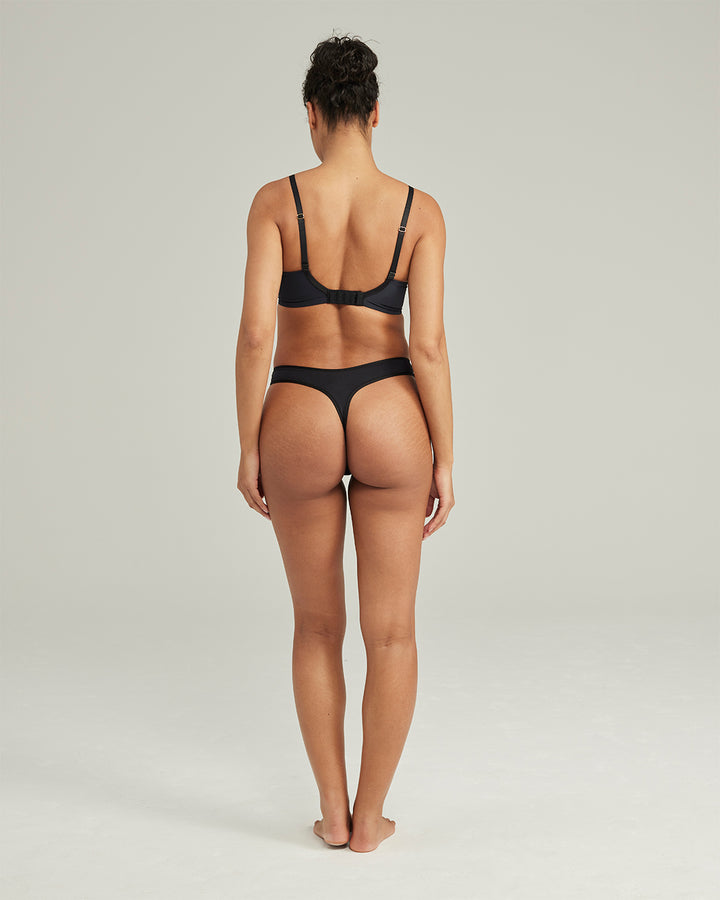
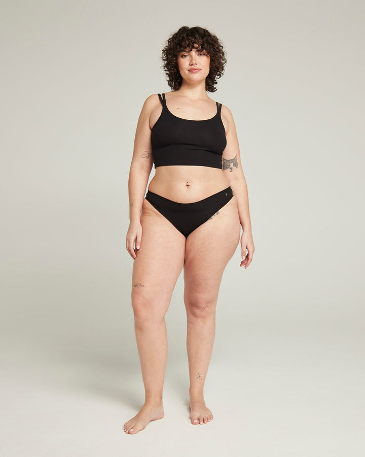
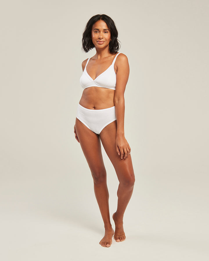
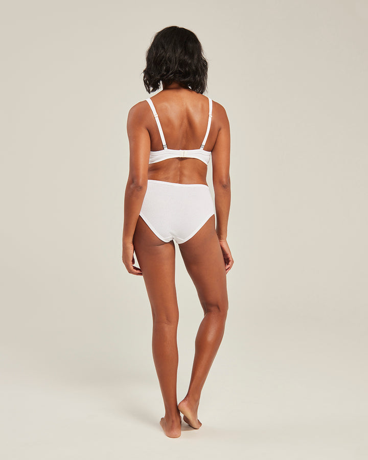
Complete the look
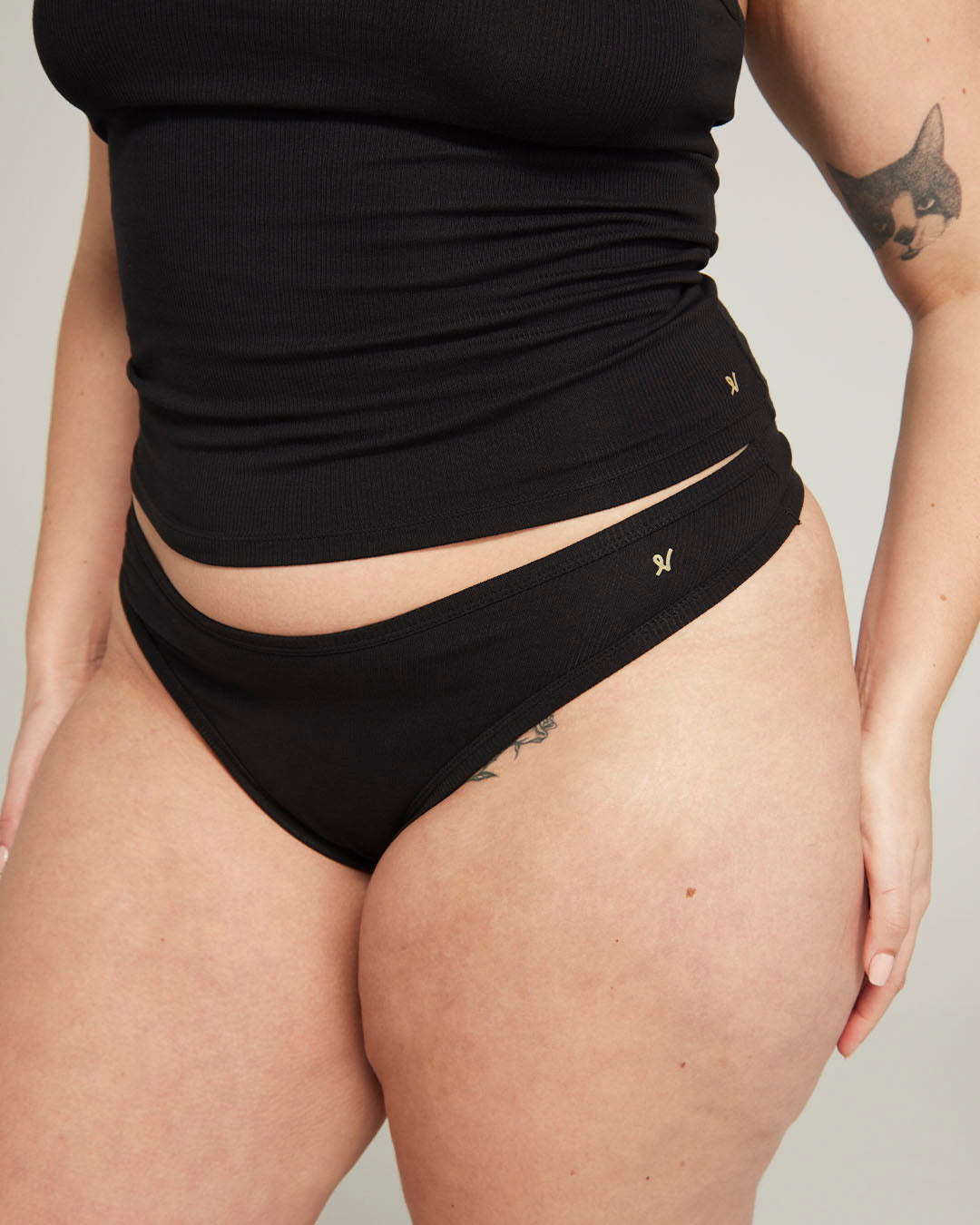
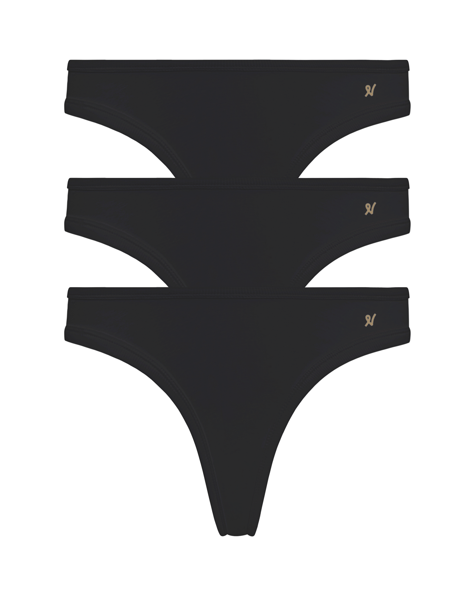
Make it a set with matching briefs


Value proposition statement
An off-canvas drawer that slides in from the right-hand side of the viewport. This drawer is used for ease of accessibility to customise items currently in the cart and to provide user feedback throughout the purchasing experience.
A good site footer becomes the visual anchor of an e-commerce store in which users are able to see all the key categories and pages at a glance with minimal interaction.
The look and feel of the header is the key ingredient to a consistent user experience that all good websites share. It controls all the links guiding and navigating the user across the website which ultimately builds trust within the store.
This block is the visual anchor of every collection page and is used to quickly identify which category the user is currently browsing.
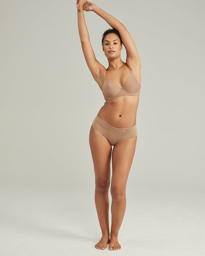
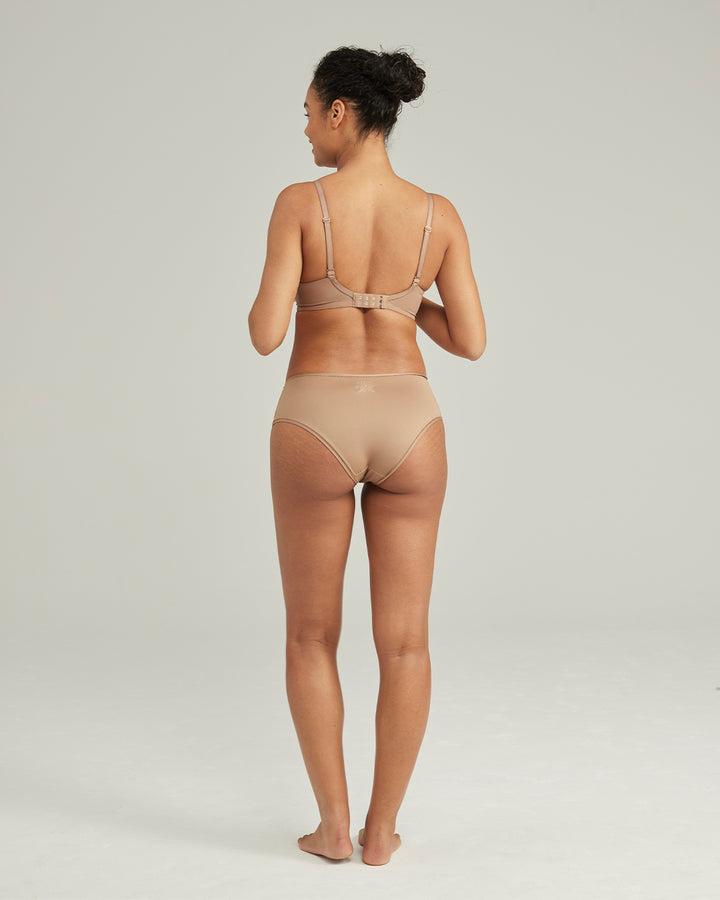
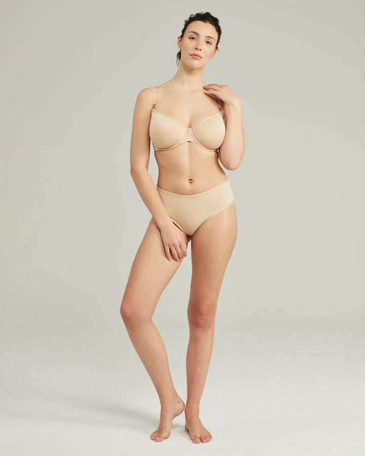
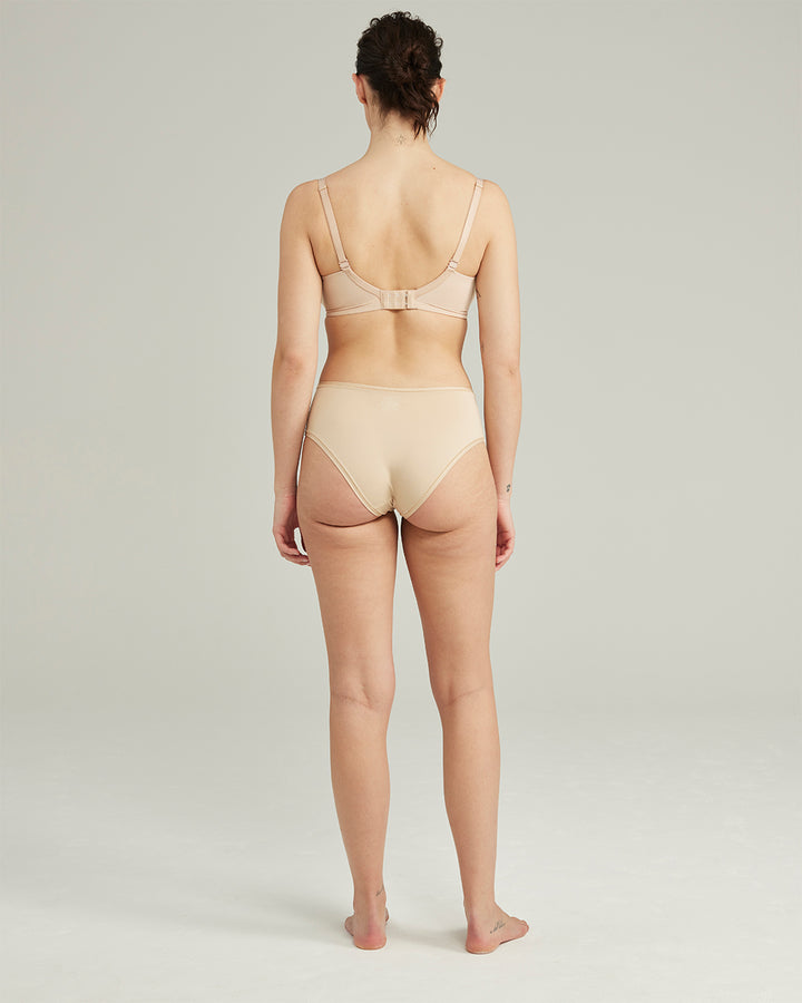
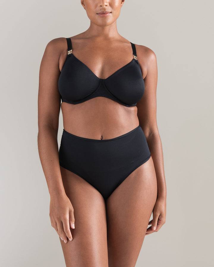
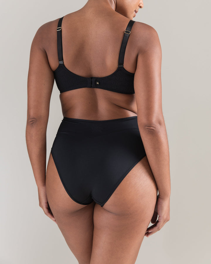
Product cards are a medium-sized component that contains key product information such as a featured thumbnail, title and price. These products cards are shared across the theme and are one of the most re-usable components available.
The product form is one of the most important components of any e-commerce interface. It is the UI in which users are selecting and clicking around to customise options of the product they will ultimately be adding to their cart.
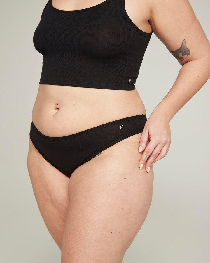
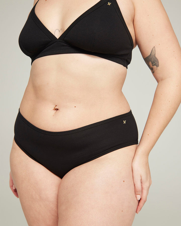
Product images displayed in an intuitive layout to let customers see what the products look like with the support of extra functionality such as clickable thumbnails and image zoom on hover.

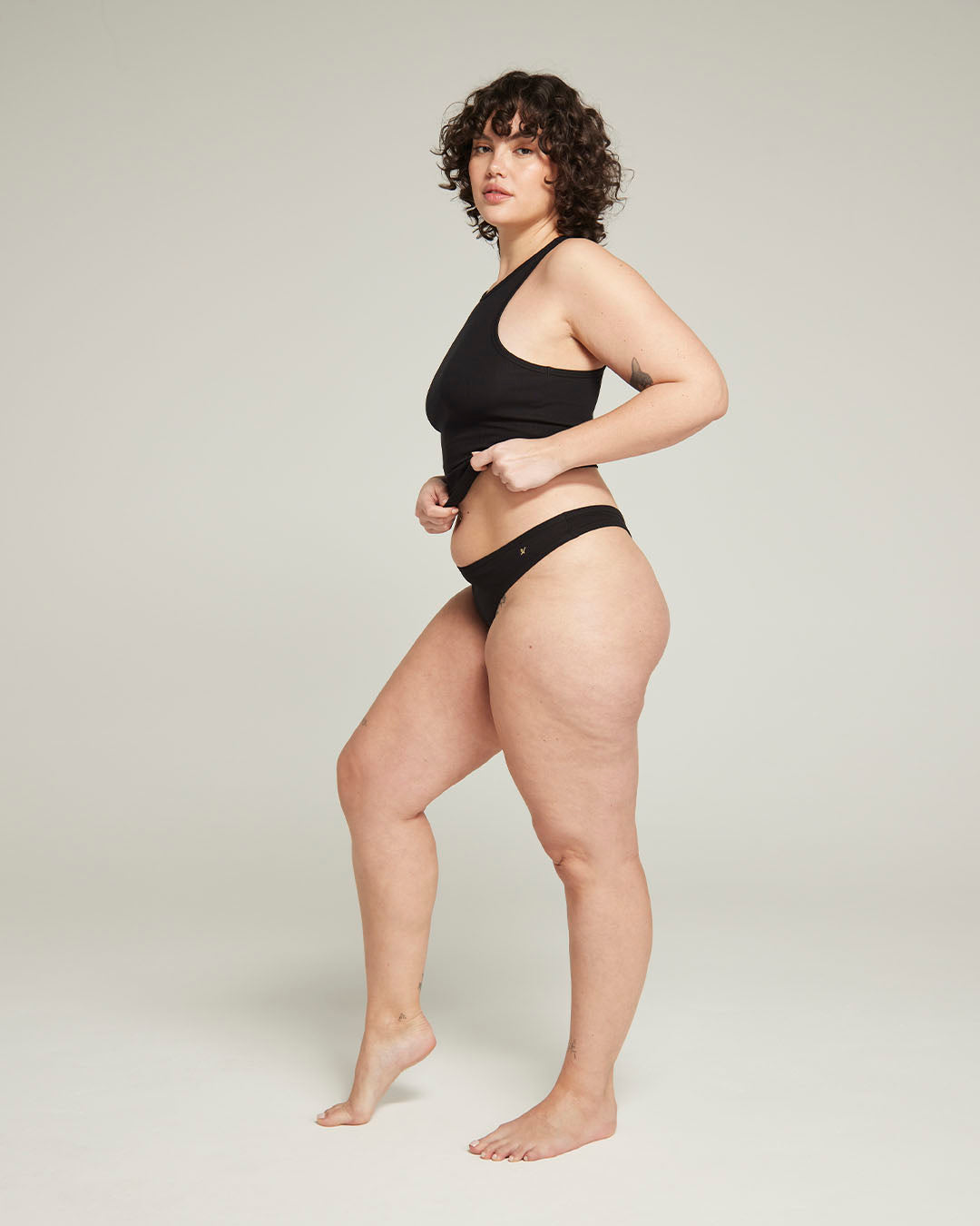

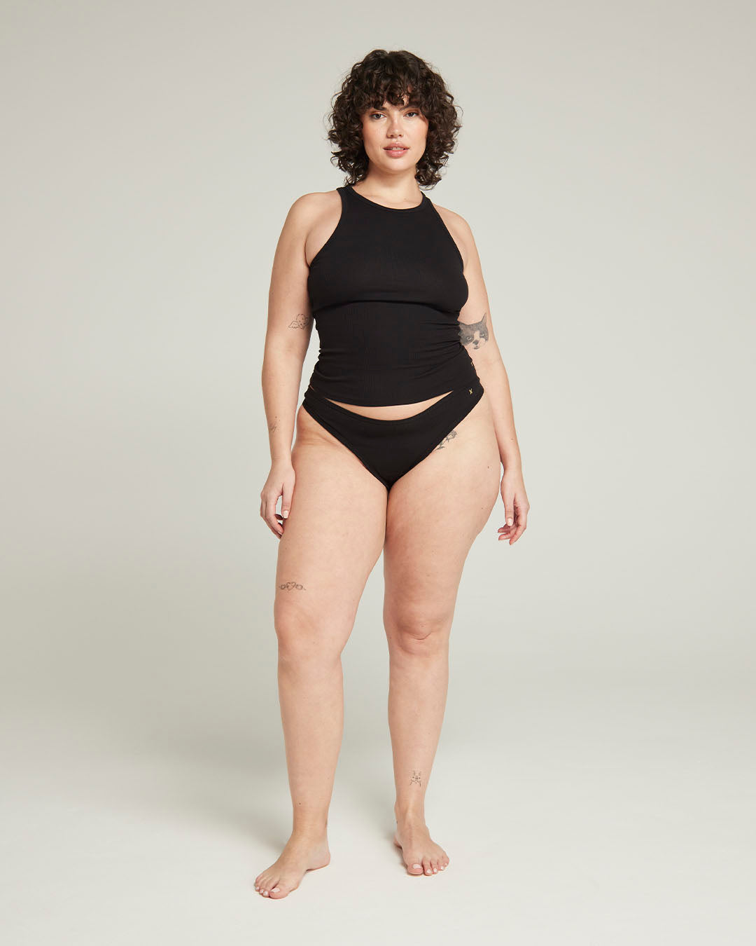

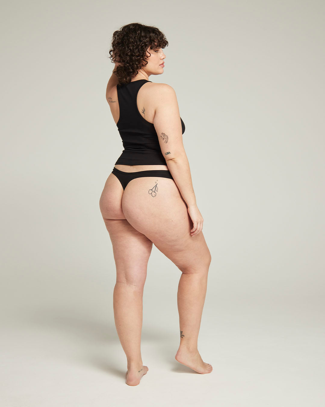


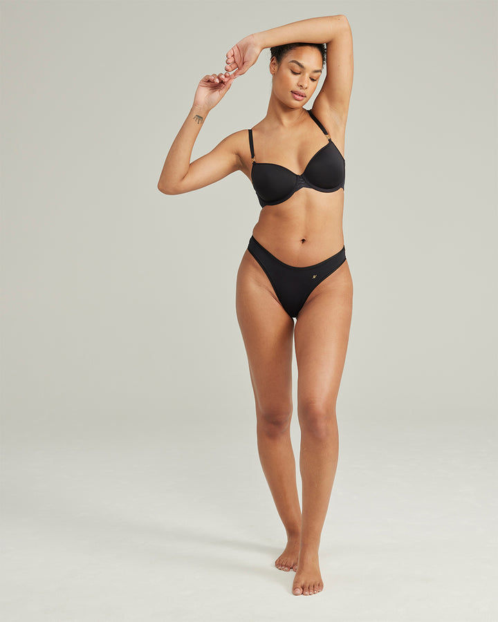
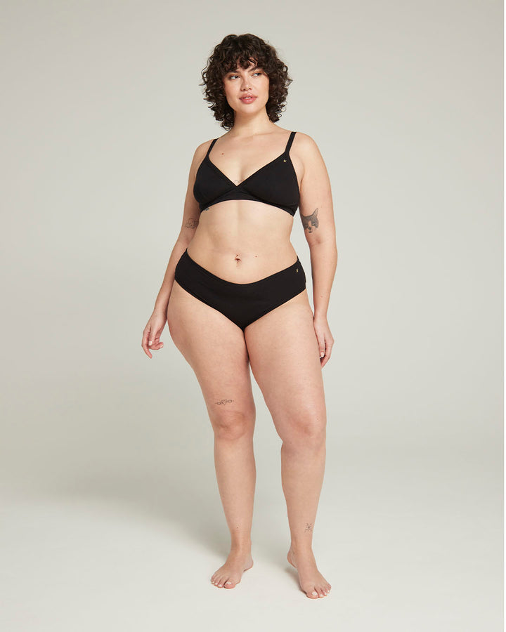
Lucy wears a size XXL.


Lucy wears a size XXL.
Product swatches are styleised options that abstract the default dropdown menus away and allow for branded selectors to the product form to enhance the user experience.
A snapshot of what to expect after this step of the process such as subtotal, VAT, shipping and taxes. This is also the last interface before users leave for the checkout stage.
Total
A loosely coupled flex table to display and interact with items currently in the customers cart.